Every business leader knows the importance of setting goals and tracking key performance indicators (KPIs). The great leaders know that data is only as good as the insights you gather and the actions you and your team take after understanding that information. Below are some key lessons to consider when creating your plan for measuring success.
How data is presented matters
There is a reason that data visualization is a separate technique, skill, and platform from collection and analysis. While the process of collecting data such as customer preferences, sales numbers, or marketing engagement is crucial, the way the data is presented is equally, if not more important. Let’s take a look at a basic example of sales by quarter.
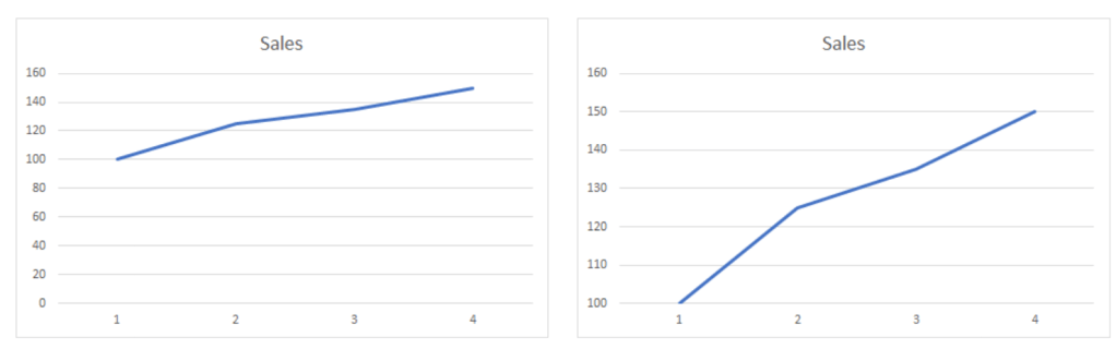
It is the exact same data, but at first glance the graph on the left looks like sales have been growing slowly and with the graph on the right, sales growth looks much more impressive. This illustrates how you visually share data may skew interpretations and therefore subsequent actions by your team or customers.
Benchmarks bring meaning to your data
Without context, it can be difficult to find insights. Using the example from above, it appears that business has been good in 2020. You’re seeing a steady increase in quarterly sales. But what if we introduce 2019 sales?
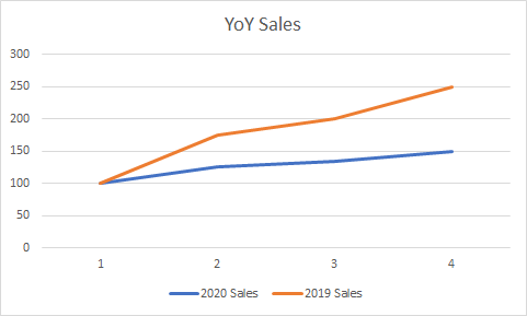
Two things emerge from adding in the prior year’s sales. You lost sales from the end of 2019 to the beginning of 2020. You also are seeing a more sluggish growth rate. This may change your view on the success of 2020. In addition to historical data, you can also add in industry or competitor benchmarks.
Changing how and what you measure can be acceptable
You may have heard that consistency is key to measuring results so you can compare year over year (YoY) data like the example above. I agree that you should always compare like for like, but what if your business or environmental factors changes? It would be foolish to keep focusing on the same exact thing year after year for the simple sake of consistency. For instance, what happens if you’ve dramatically reduced your costs in 2020?
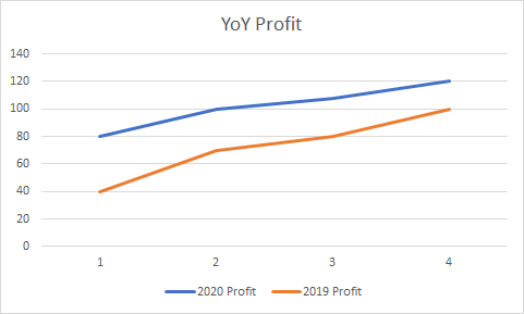
This new chart tells a different story. While your gross sales in 2020 were less than 2019, you are actually making more money. This is a simple example as to why it sometimes helps to look at different success metrics.
Collecting and presenting data is only the first step
More important than setting up a process for collecting and reporting data is the process of ingesting that data into your strategic planning process. Numbers are great. Numbers that tell a story are even better. Numbers with a clear story that point you to a plan to improve your business are the best.
